Test Insights
Insights turns your Testkube executions into a real-time dataset you can analyze to better understand how you work. This feature allows teams to track key performance indicators including the number of test executions, pass/fail rates, execution durations, and more, all within a user-friendly Dashboard.
With Test Insights, DevOps and QA managers can quickly answer crucial questions that impact the testing cycle and overall software quality, such as:
- Which tests take the longest to execute and why?
- Which tests have the highest failure rates?
- How do test performance metrics vary by type of test or by the tools used?
- How do key test execution metrics change over time?
By integrating Test Insights into your testing workflow, your team can leverage several benefits:
- Enhanced Visibility: Gain a clear overview of testing activities and outcomes, helping you manage and prioritize testing resources more effectively.
- Data-Driven Decisions: Make informed decisions about where to allocate efforts for improving test efficiency and reliability.
- Improved Test Efficiency: Identify and address inefficiencies in your testing process, leading to faster development cycles and higher quality software releases.
Workflow Metrics
The default metrics exposed for analysis in Test Insights are the metrics collected for each Workflow Execution:
- Workflow Status
- Execution Duration
- Resource Usage - Read More.
These can be further filtered and segmented as described below.
Granular Metrics
Testkube stores tool-specific measurements as named time series data on top of the Workflow metrics outlined above. By default Testkube extracts and exposes granular metrics for individual Test Cases and Performance Tests, but you can provide Testkube with any Custom Metric that you would like to track together with your test results.
Granular Metrics requires Postgres as your Testkube Database - they are not supported on Testkube deployments using MongoDB.
Configuration
Granular metrics are enabled by default. The control plane worker service ingests supported reports from workflow artifacts into time series after each execution completes.
To explicitly enable or disable ingestion, set the testkube-worker-service.granularMetrics.enabled Helm value on your deployment:
testkube-worker-service:
  granularInsights:
    enabled: false
Set the value to false to disable granular metrics ingestion, in which case the Insight module will not show
granular measures for executions processed while ingestion is disabled.
Built in Granular Metrics
Once granular metrics are captured, they appear as measures in an Executions Time Series analysis. Granular metrics are grouped by category to make exploration easier.
| Insights group | Example metric keys |
|---|---|
| Junit Test Case Metrics | test_duration_ms, test_count_failed, test_count_passed |
| Request Latency | http_req_duration_p95_ms, response_time_mean_ms, latency_p99_ms |
| Request Throughput | http_reqs_rate, http_request_rate, rps_mean |
| Traffic Volume | data_received_count, data_sent_count, received_kbytes_per_sec |
| Request Errors | http_req_failed_rate, error_count, errors_etimedout |
| Request Volume | http_reqs_count, sample_count, requests_completed |
| Virtual Users | vus, vusers_created, virtual_users |
| Checks & Assertions | checks_passes, checks_fails, assertions_failed |
| Custom Report Metrics | Any detected report metric that does not match one of the above groups |
Insights chooses a default aggregate based on the selected metric key. Count-style metrics usually default to sum, while latency, rate, percentage, throughput, and byte-rate metrics default to maximum so the first chart highlights the highest observed value in each time bucket. You can still select another available aggregate when a different view is more useful.
Segmentation and Filtering
In addition to standard filtering and segmentation, granular metrics support segmentation and filtering based on a set of identity fields. Each series includes identity fields derived from the tool that produced the report. Below is a table of common identity fields for the supported report sources.
| Report source | Common identity fields | Notes |
|---|---|---|
| JUnit report | Testcase, Testsuite | Test cases and suites are uniquely identified by their name. If you have the same test case name across multiple workflows they will be aggregated together (a workflow filter can help mitigate this issue). |
| Influx line protocol | Tag keys from each line | Each tag on a line protocol record becomes an identity field (for example status=200 or scenario=checkout). Use stable, low-cardinality tag keys so segments remain readable in Insights. |
| k6 summary | Scenario, Endpoint, k6 metric tags | k6 only writes tagged submetrics to the summary when the script requests them, usually through thresholds. Global metrics such as total received bytes or max VUs may not have scenario or endpoint identity. |
| Artillery report | Scenario, Transaction | Scenario identities come from named Artillery scenarios. Transaction identities come from endpoint-level metrics when the report includes them. Other aggregate metrics remain workflow-level when the report does not include scenario or transaction context. |
| JMeter statistics | Transaction | JMeter dashboard statistics are keyed by transaction label, including Total. |
Using Test Insights
Test Insights are available from the top and left navigation menus. The Insights sidebar helps you navigate between boards:
- All Boards — a searchable grid of every board you can access in the Organization
- Execution Analysis — the default board with premade charts
- Pinned Boards — boards you have pinned for quick access
- Shared Boards — boards shared across the Organization
- Private Boards — boards visible only to you
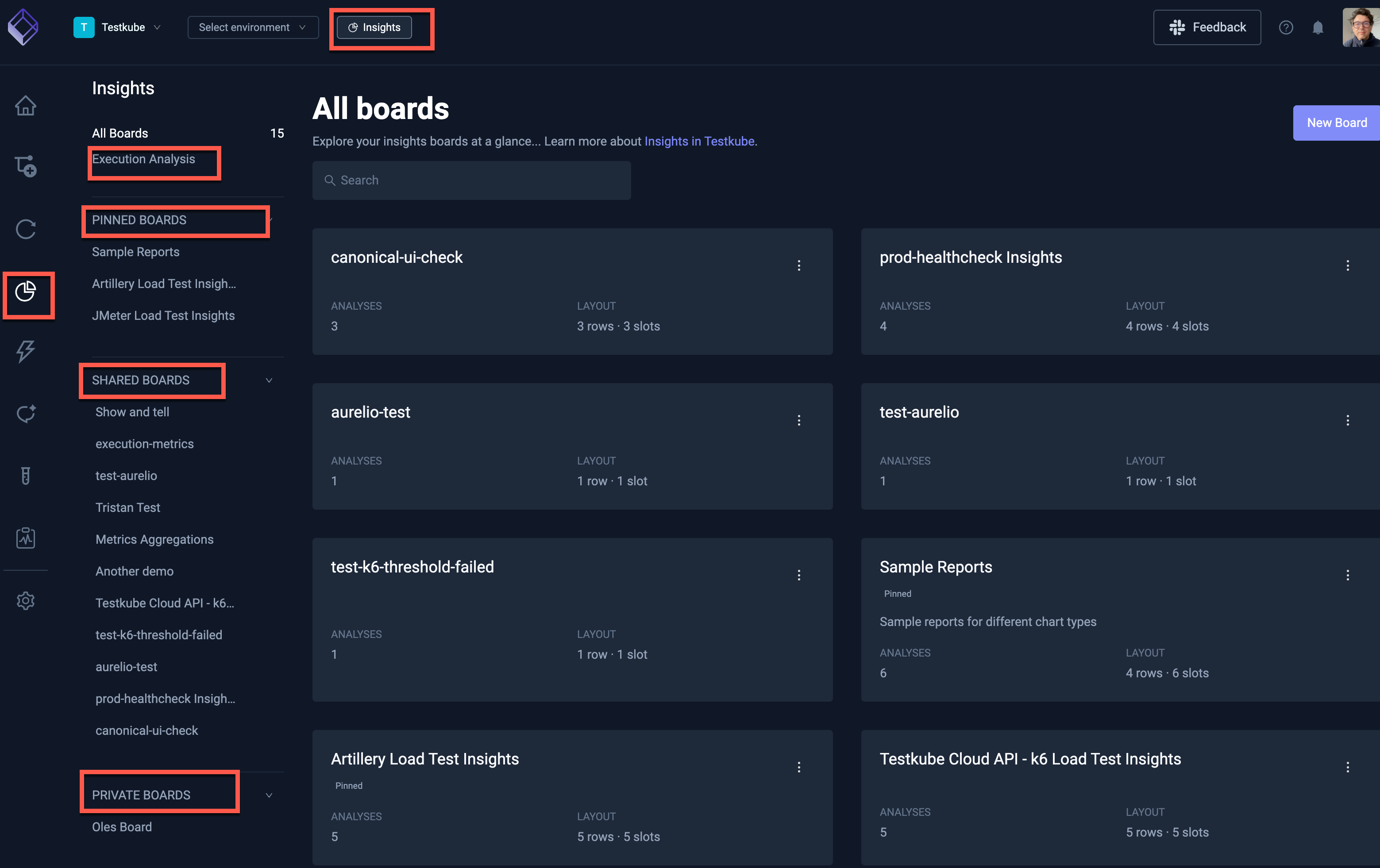
Use All Boards to browse, search, and paginate through every board at a glance. Each card shows the board name, description, analysis count, and layout summary. Click a card to open the board.
You can create a board from + Create a new board at the bottom of the sidebar or from the New Board button on the All Boards page.
Boards can be shared across the Organization or kept private. Private boards are visible only to their creator. Shared boards are visible to all Organization members, but only the creator or an Organization admin can edit or rearrange them. Deleting a shared board requires Organization admin permissions.
Pinning a board is personal — it adds the board to your Pinned Boards section without changing who can access it.
If Insights should not be available in your Organization, disable it from the Product Features Panel.
Insights Boards
The Default Execution Analysis Board
The default Execution Analysis board has three sections which all show data over the last month:
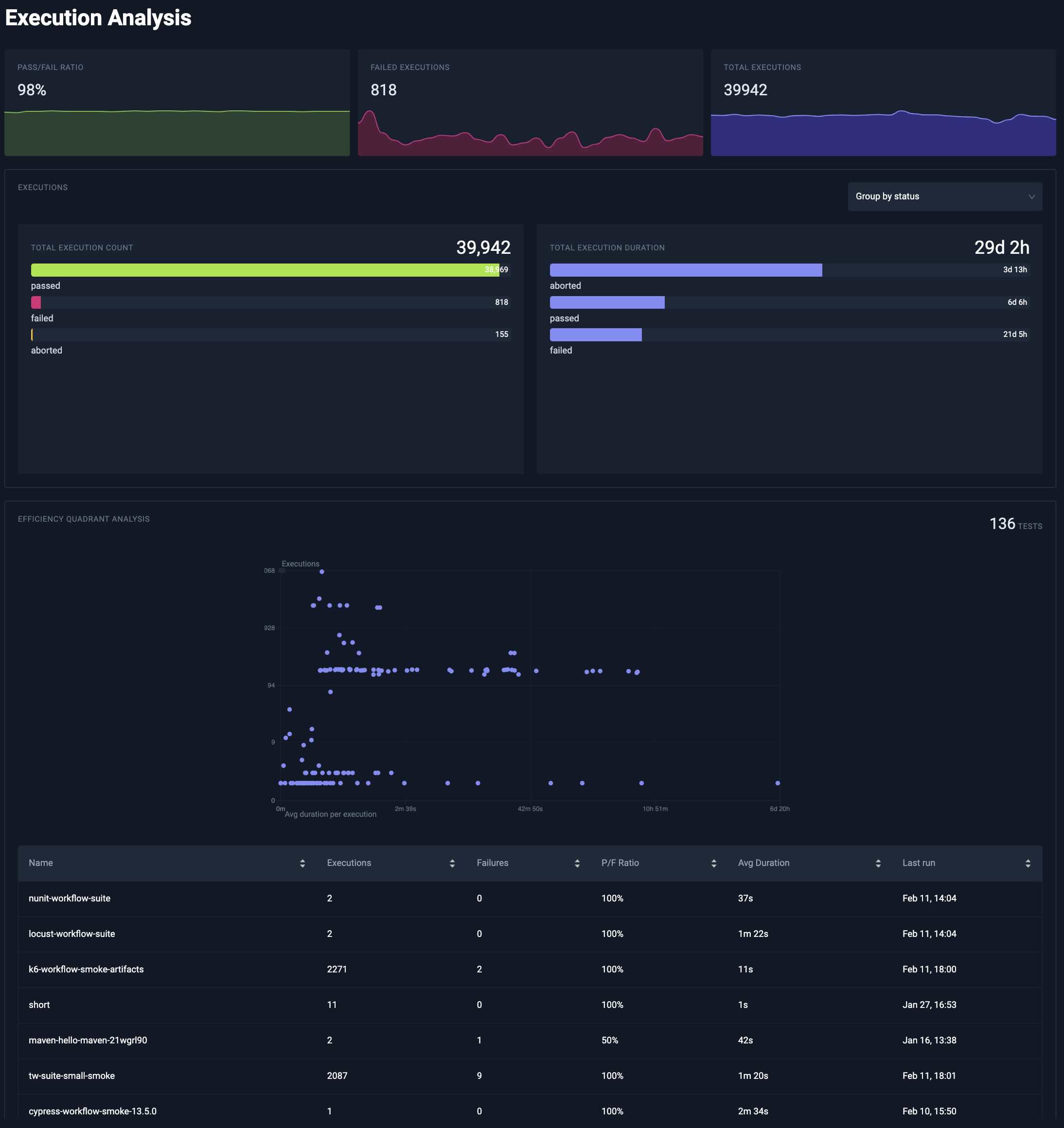
The top part of the Execution Analysis module shows high-level execution metrics.
Underneath you can find a quick overview of execution count and duration. You can either group your executions by status or workflow by using the selector.
Lastly, the execution efficiency analysis shows tests by execution time and frequency. Tests that frequently run and take longer to execute appear in the top right quadrant, highlighting them as prime candidates for optimization to reduce testing bottlenecks, improve cycle times and optimize infrastructure costs
Board Visibility
When you create or edit a board, you can choose its visibility:
- Shared across organization — visible to all Organization members. The creator and Organization admins can edit the board and its analyses. Organization admins can also reorder shared boards in the sidebar.
- Private — visible only to you. You can edit and delete your private boards.
Private and pinned boards show Private and Pinned badges on the board page and on cards in All Boards.
Managing Custom Boards
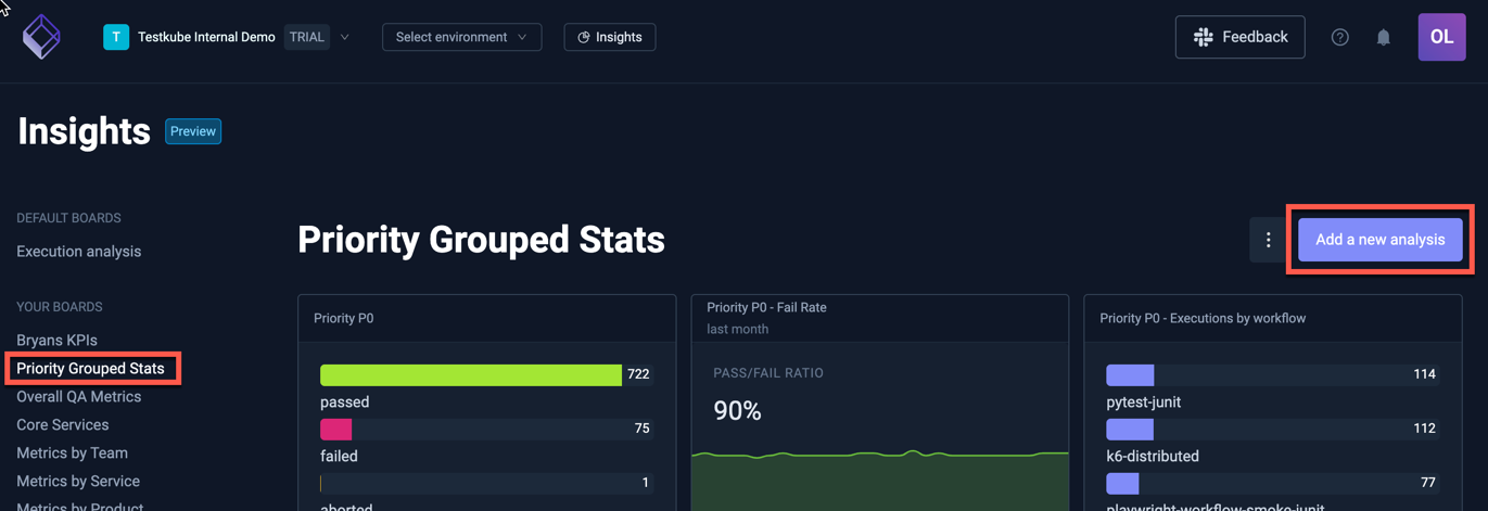
You can add as many boards as you need to Insights under an Organization and each board can in turn contain as many analysis charts as needed, allowing you to group your analysis in any way that aligns with your testing activities.
You can manage a board as follows:
-
Create Board: Click + Create a new board in the sidebar or New Board on the All Boards page. In the creation dialog, set the name, slug, description, and visibility, then add your first analysis.
-
Pin Board: Pin a board from its actions menu (on the board page or on a card in All Boards) or from the pin icon next to a board in the sidebar. Pinned boards appear under Pinned Boards for quick access.
-
Reorder shared boards: Organization admins can drag shared boards in the sidebar to change their order for everyone in the Organization.
-
Rearrange analyses: Hover an analysis and use the handle in the top-right corner to drag and drop it. You can move it to a new row or place it before or after another analysis. You can only add up to three analyses per row. Board layouts are optimized for larger screen sizes.
-
Duplicate analysis: Open an analysis actions menu and choose Duplicate Analysis to copy its configuration onto the same board.
-
Update Board: Click the board title on the board page to rename it inline, or open Settings from the actions menu to update the name, slug, description, and visibility.
-
Delete Board: Use Delete in the board actions menu, or open Settings and delete the board in the danger zone at the bottom. Your board and all analyses will be removed; no execution data will be deleted.
Working with Analyses
You can add as many analyses to a board as needed; use the "Add a new analysis" button on the top right to do so:
Adding an analysis takes you to the Analysis editor where you can configure what data to show and how to show it.
The anatomy of the Analysis Editor
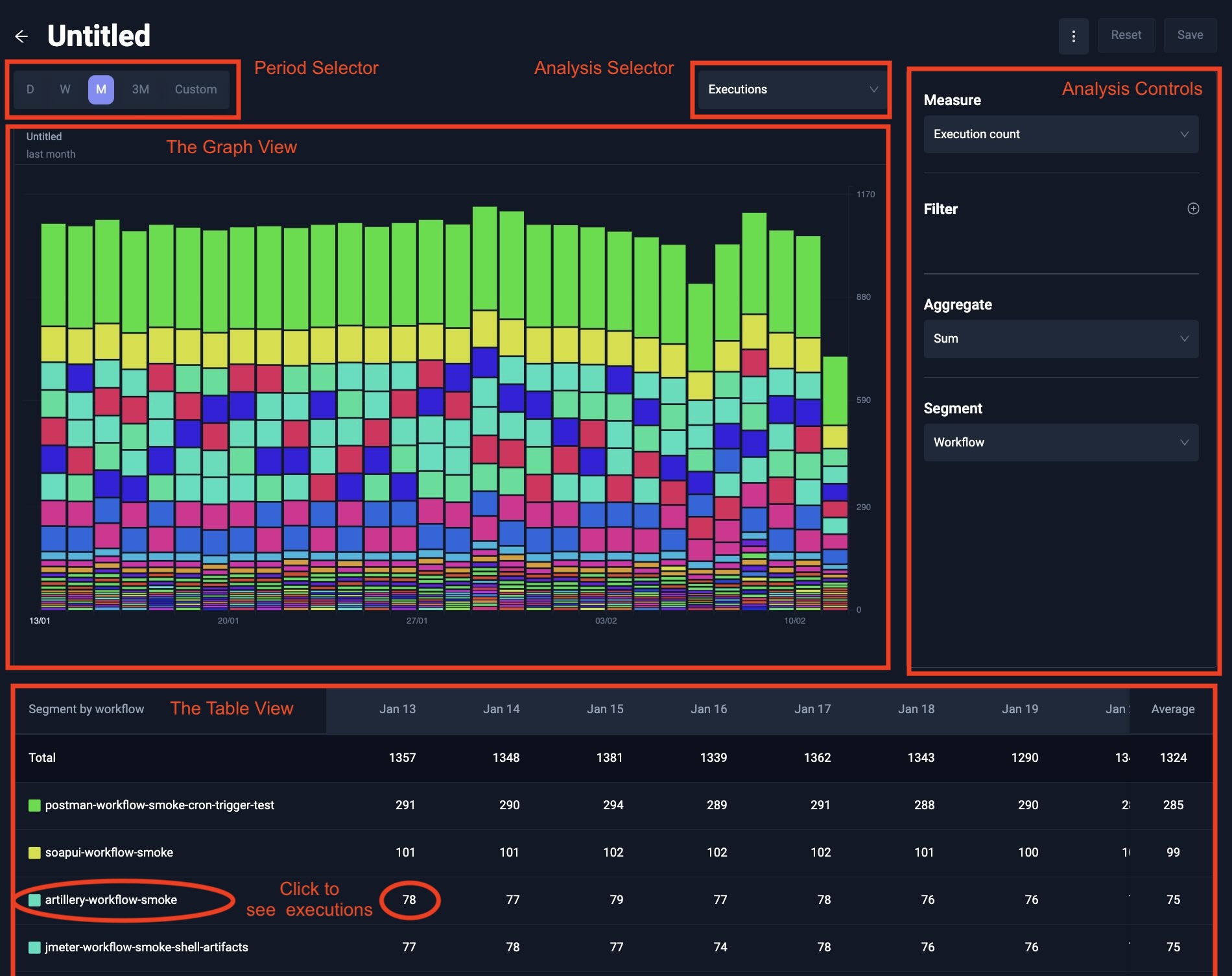
At the top you can see a Period Selector for selecting the last day, week, month, quarter or any custom period. The interval is automatically inferred depending on the size of the period. A period less than two days will have an hourly interval, then daily, and up to weekly when looking at a quarter.
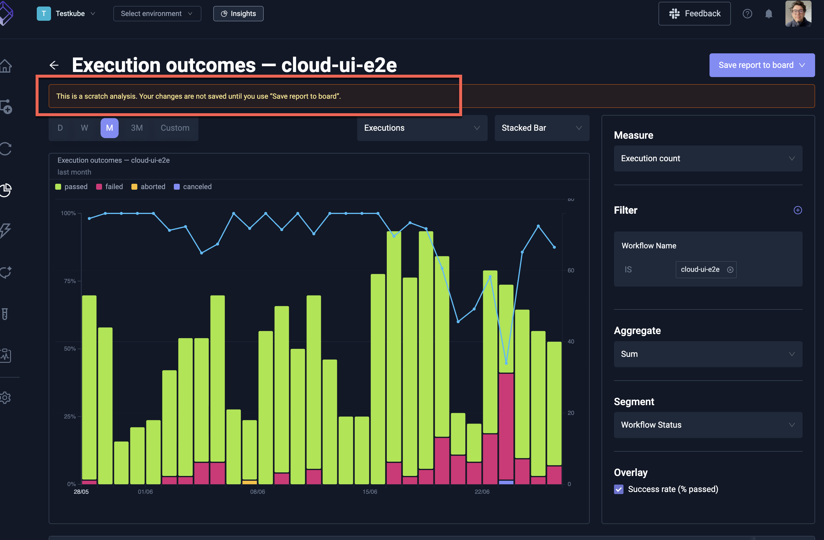
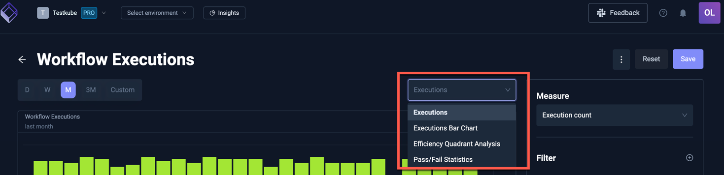
More to the right, you can see the Analysis Selector: it defaults to Executions time series, but you can also select Executions Bar Chart, Efficiency Quadrant Analysis and Pass/Fail Statistics (all described below).
Under the period and analysis selector, you will find your selected chart with its controls on the right side. The controls vary depending on the selected chart and include the ability to filter executions on Workflow name, environment, status, labels, and measure specific fields (such as test case name).
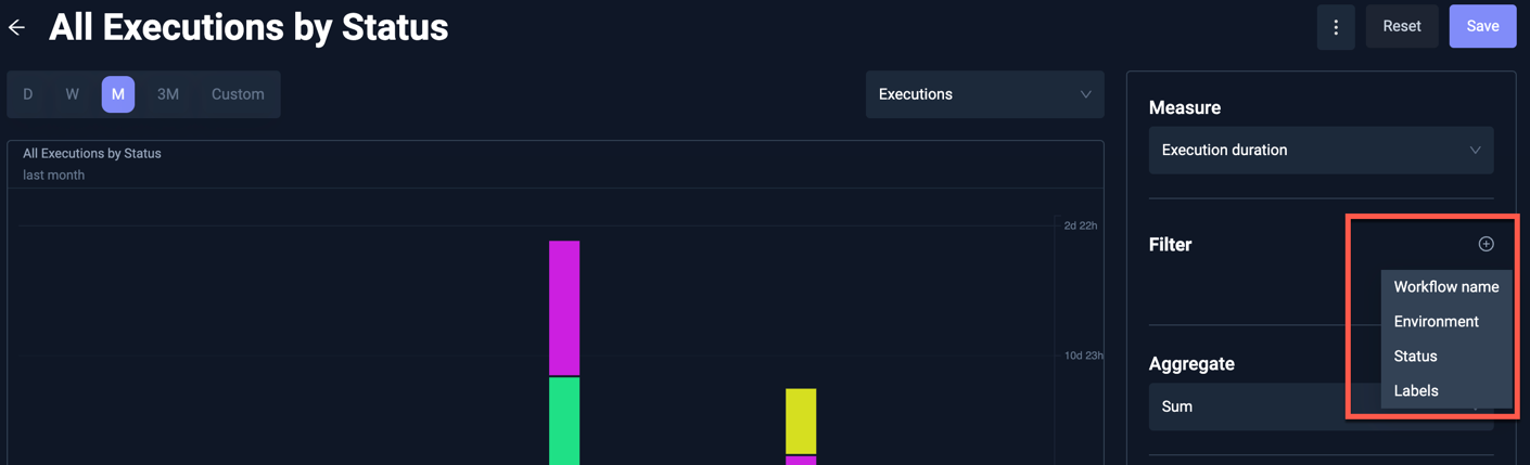
Workflow name, labels, and measure identity fields, support multiple filter operators such as IS (exact match) and CONTAINS for partial matches. Just click on the operator to switch.
Executions Time Series
The execution time series allows you to analyse your executions over time.
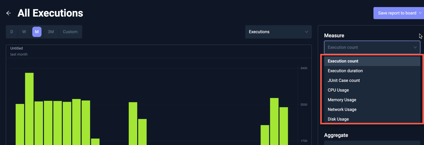
Executions Measure
The x-axis will always be the time, whereas the y-axis is defined by your Measure. There are three categories of measures that are supported.
- Execution measures: These measures give high level summary information about your executions.
- Execution count: Use this to see how many Workflows were executed
- Execution duration: Use this to understand how much time your tests are taking.
- JUnit Case count: The number of JUnit tests execution based on extracted JUnit Reports.
- Resource measures: See resource usage across executions. Read more about Resource Aggregates in Insights.
- CPU Usage: Use this to analyze CPU consumption of your Workflow executions.
- Memory Usage: Use this to analyze Memory consumption of your Workflow executions.
- Network Usage: Use this to analyze Network usage of your Workflow executions.
- Disk Usage: Use this to analyze Disk usage of your Workflow executions.
- Granular Metrics: When granular metrics are enable you will see additional measure options depending on the types of reports your workflows produce.
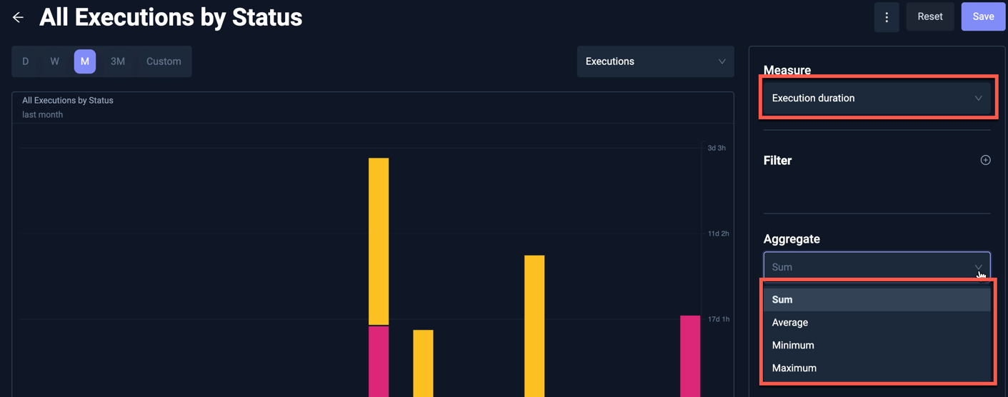
Executions Aggregate
You can use the Aggregate to decide how to treat multiple executions of the same workflow within each interval. For example, for the Execution duration you can aggregate on sum, average, minimum or maximum.
The actual aggregate(s) available will depend on which Executions Measure you selected.
Executions Segment
Lastly, you can set a Segment which will break down your executions. You can do this by the status to see which executions passed or failed, by workflow name or by any of the labels found on the executions.
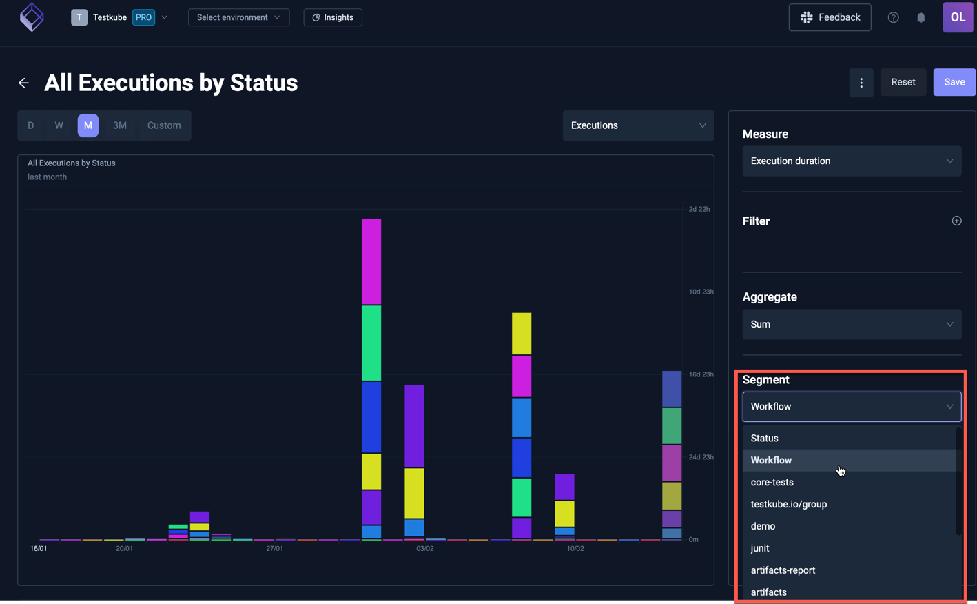
Chart Types
The Chart Type selector in the analysis editor header controls how segmented execution data is visualized over time. Eight chart types are available:
| Chart Type | Description |
|---|---|
| Stacked Bar | The default. Segments are stacked within each time bucket to show totals and composition. |
| Grouped Bar | Segments are drawn side-by-side within each bucket, making it easier to compare individual segment values. |
| 100% Stacked Bar | Each bucket is normalized to 100%, showing the relative share of each segment rather than absolute values. |
| Stacked Line | A stacked area chart — the line equivalent of stacked bars. Useful for seeing how segment composition changes over time. |
| Line | One independent line per segment. Each segment is scaled to its own peak, which highlights trends for individual segments. |
| 100% Stacked Area | A normalized area chart where each time bucket sums to 100%, showing segment share over time. |
| Heatmap | A time-by-segment grid where color intensity encodes value. Works well when you have many segments and stacked bars or lines become hard to read. |
| Horizon | One small area chart per segment, stacked vertically as small multiples. All segments share a common scale so you can compare magnitudes across segments. |
Use 100% Stacked Bar or 100% Stacked Area when you care about proportions (for example, the pass/fail mix) rather than absolute counts. Use Heatmap or Horizon when segmenting by a high-cardinality dimension such as workflow name or test case.
Segmented charts display a color legend above the chart. Hovering a legend entry, a chart segment, or a row in the drilldown table cross-highlights that segment across every time bucket (dimming the rest), making it easy to follow a single segment through the full period.
Success Rate Overlay
When your analysis is specifically looking at test counts (using the measure Execution count and segmenting by Status) an Overlay option appears in the controls panel. This will include an overlay showing the pass rate over time on top of the raw counts.
Executions Table and Drill Down
Besides a graph view, the Executions time series analysis also comes with a table view. This is useful to see trend across a single segment. Currently, segmentation within a graph is also limited to 25 largest segments. For segmentation with a high cardinality, you can view the remaining segments within the table, which are most often too tiny to see within the Graph View.
You can click on either the segment name or a table cell value to drill down on the execution references that relate to this. Imagine that you filter on failed executions for a certain label, and you wonder which executions are failing. Drilling down easily allows you to analyse and troubleshoot these executions.
For example - the following Analysis shows all Executions labeled junit=true, with February 7th highlighted when there
were 12 failed executions:
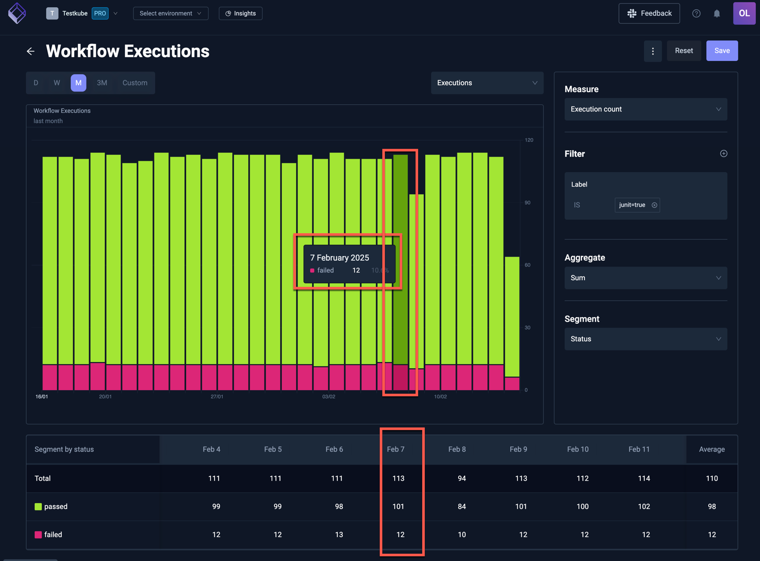
Clicking on the "12" in the table will show those 12 executions in a table:
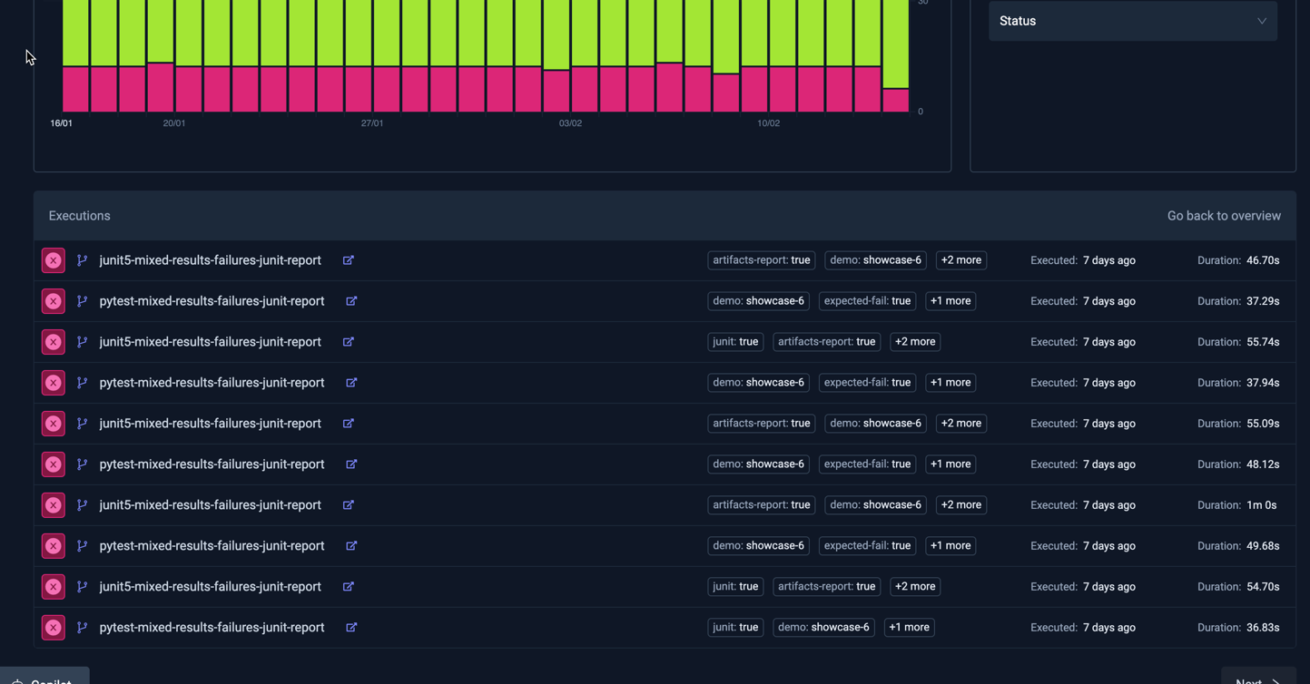
- Selecting an execution will open the corresponding Workflow Execution Details panel.
- Selecting the "Back to overview" link on the top right of the table will take you back to the table view above.
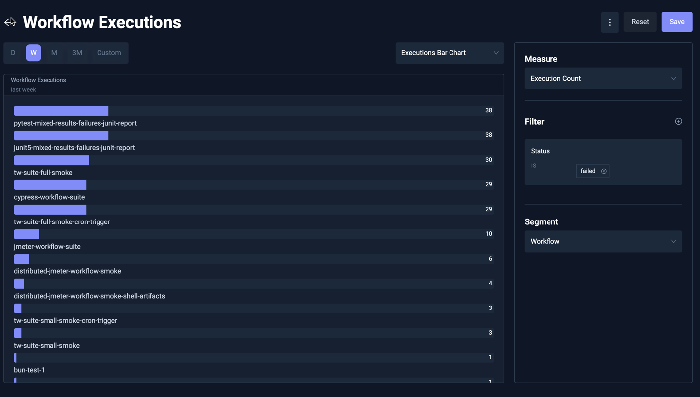
Executions Bar Chart
This shows a bar chart with the number of executions for each selected segment. For example, the below Analysis shows the top failing Workflows over the last week:
Efficiency Quadrant Analysis
The execution efficiency analysis shows tests by execution time and frequency. Tests that frequently run and take longer to execute appear in the top right quadrant, highlighting them as prime candidates for optimization to reduce testing bottlenecks, improve cycle times and optimize infrastructure costs:
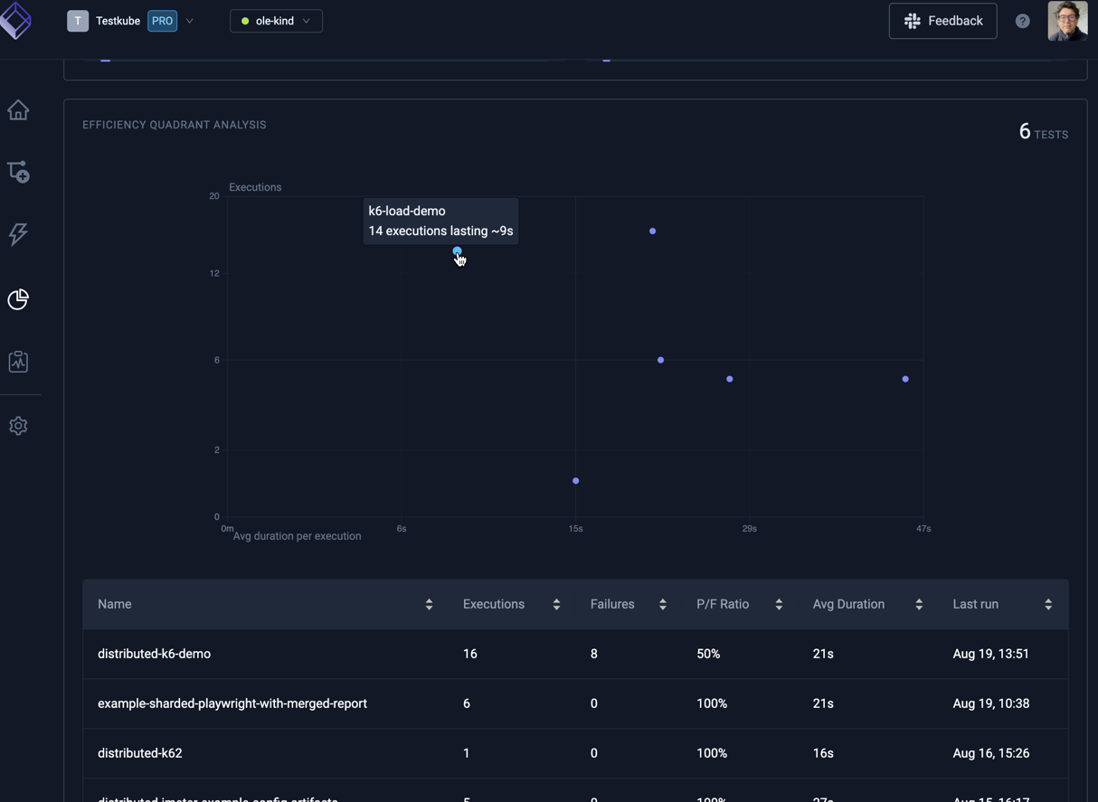
Hovering a marker in the chart reveals the corresponding Workflow.
The table below the chart shows plotted Workflows sortable by a number of attributes.
Pass/Fail Stats
The pass/fail stats shows details about workflow executions that failed or passed. These analysis are useful to quickly understand if certain workflows need attention.
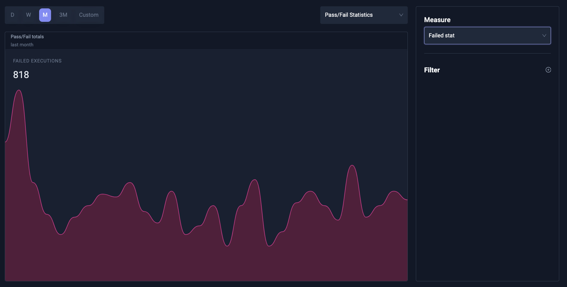
Pass/Fail stats can also be overlayed over Execution charts as described above.
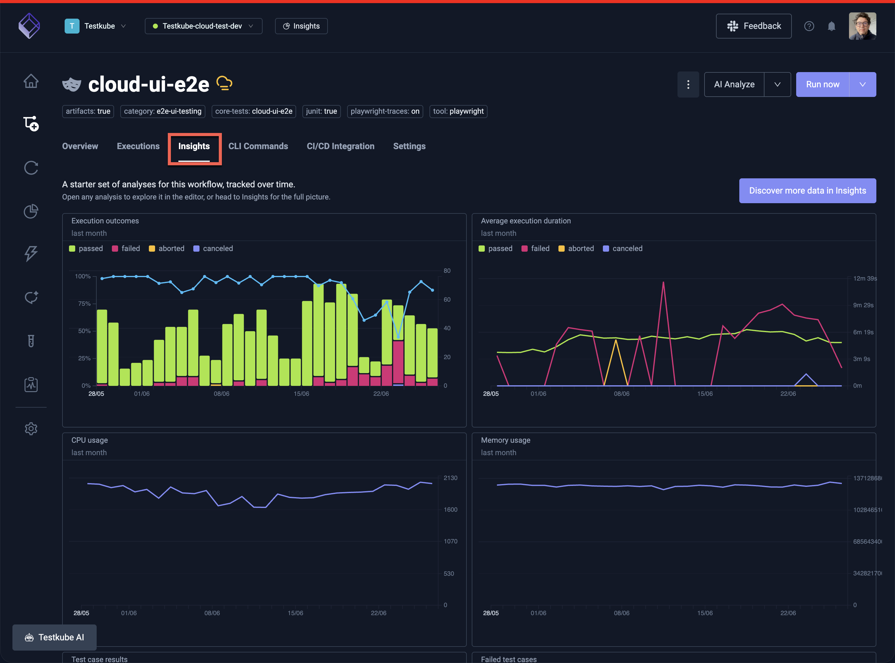
The Default Workflow Insights Board
A fixed Insights board is also available at the Workflow level, containing default chart to visualize general functional and operational metrics for the Workflow:
Customizing
Opening an analysis on this boart allows you to customize the anlaysis as outlined above but any changes must be saved to a separate Insights Board, as indicated by the notice on the top: